Friday, February 4, 2011

Pitcher and Cup

Pitcher and Cup 9 x 12 pastel, copyright 2011

The little pitcher in this painting was made by Clara Whitman Parrett from Connersville, Indiana.  She was one of the artists featured in the Starving Artists Invitational Show last month.  The show was a big success; 13 pieces were sold, and unusually high number, and we had a lot of traffic despite the bad weather.   It also went well for me personally, since I sold a piece to someone other than a relative or close friend for the first time, and bought this pitcher.

I enjoy painting ceramic and glass pieces, though they can be quite challenging.  Light can bounce off at odd angles, pieces reflect one another and the background, and shadows fall in unexpected places.  I couldn't count how many times I reworked this one, tweaking it a bit here and there.  I'm still getting used to the rougher texture of the paper which makes blending a little more difficult.   But it was a welcome break from the snow paintings, especially after the ice storm earlier in the week.

By the way, more of Clara's beautiful and utilitarian pottery is for sale at the Arts Center.  

Wednesday, February 2, 2011

Google Art Project

http://www.googleartproject.com/

This has got to be the best idea since sliced bread, or to put it in artists' terms, since paint came in a tube.   I've just discovered it today, apparently it went online last week.  It is the same idea as StreetView, where you virtually walk around a city, looking at photographs taken by Google staff.  But this site is for art museums, and not just any art museums.  Included on the list is everything from MoMA to the Uffizi to the National Gallery in London.  You can "walk" around the museums, search for specific works and look at them much closer than you ever could in real life.  Individual brushstrokes in the hair of Venus are visible, for example, and side bars give additional information on Botticelli and the piece itself.

This is an ongoing project, with 17 museums so far, and more to be added.  Can you tell I'm excited about this?  If you don't hear from me in the next couple of days, you know where I will be.  Maybe we will bump into each other in St. Petersburg!

Tuesday, February 1, 2011

Winter Fog

Winter Fog 6x6 oil, copyright 2011
SOLD!

This one gave me fits when I photographed it, making the snow looks a bit washed out.  It's probably my favorite so far though, I really like the mood of it.  The dry brush technique was used over most of it to give it a very soft look.  For the reflections in the water, paint was applied thinly and the dry brush dragged across it in a downward direction.  You can see a lot of the bright blue underneath.  Just yesterday I realized that the applied base coat has a specific terminology: ground.  So my ground is an acrylic wash with a pastel primer.  

I realized two other things during this painting.  Reflections work best with a minimal amount of paint and detail, at least on such a small scale.  The eye does a good job of filling in assumed detail as long as the reflection has a vague resemblance to the objects.  I also discovered that the quality of the paint really does make a big difference.  A better quality paint, such as Winsor and Newton, is thicker, smoother and more opaque than less expensive brands.  As the tubes go empty I am replacing them better ones.

Sunday, January 30, 2011

Winter's Deep

Winter's Deep 12 x 9 pastel, copyright 2011
SOLD!

I have had more than enough of snow and cold, to point of wishfully looking up real estate in Belize last night.  You wouldn't know it from my paintings though.   I guess since I haven't painted snow much before this winter I feel the need to practice and perfect it.  And there is certainly no shortage of subject matter, with more on the way later this week.

This one was actually started more than a week ago, but wasn't quite right.  The Richardson paper is a dark brick red and I unconsciously chose warmer colors to go with it - which is the wrong choice when paining snow.  The original intention was to make it foggy, but that failed utterly.  I came back to it today, toning down the reds and pinks a bit with blues and yellows and defining the trees quite a bit more.  A friend recently pointed out that I had not been including the white trunks of sycamores, which are prevalent in river bottoms around here, so I will be making more of an effort to include them from now on.  I'm happy to have the feedback - I'm okay with criticism, as long as it's constructive!

Saturday, January 29, 2011

Learning curve


Snow Shadows 6x6 oil, copyright 2011
Field of Snow 6x6 oil, copyright 2011


One of the good things about doing so many of these little paintings is that I am learning rather quckly what works and what doesn't work.  With these two there was a lot of the latter and a little bit of the former, particularly with the painting on the left.

With this one I decided to experiment a bit.  I've been coating the panels with a pastel primer, which is a clear acrylic base with very fine pumice mixed in.  I was curious what would happen if I didn't use the primer and just painted directly on the surface.  This is what happened:  the surface immediately soaked up all the oil from the paint, making it gum up and very difficult to move around.  This means I couldn't really blend the paint on the surface and if I messed with it too much it rolled into little balls.  No matter how many layers I put down, the effect was the same.  From now on I will always use a primer for oil paints on clayboard.

The second one turned out better since I did use the primer for it, along with a purple wash.  I also experimented a bit with a dry brush technique.  This works by using an essentially dry brush to blend the paint after it's laid down on the surface, for a softer look.  It can work well for backgrounds but if overused in the foreground it can make the image too fuzzy.  That was one thing that actually worked in this painting.   But while a large expanse of snow in the foreground and a straight horizontal line of trees in the background can make an interesting photograph, it can also make for a boring painting.

So now I know.

Sunday, January 23, 2011

Country Road in Winter

Country Road in Winter 6 x 6 oil, copyright 2011

Our little one lane country road stretches for about 2 1/2 miles through open fields, wood lots and pasture.  It doesn't really go anywhere, which means there's not a lot of traffic; things are pretty quiet out here.  This particular stretch at the end of our driveway is a straight shot through the valley of Twin Creek before it starts gently sloping up out of the valley in the distance.  The hardest part was getting the perspective right.  I had to wipe the distant trees twice before I finally realized I was painting them too large and too detailed. 

For this one I used a black acrylic wash before starting; some of it shows through on the road and shadows on the right.  The oil paint is quite a bit thinner than the last two, especially in the sky where you can see a bit of the texture of the primer.  It's been a great to experiment with different with techniques, seeing what works best in each situation.

Thursday, January 20, 2011

Winter Reflections

Winter Reflections 6x6 oil, copyright 2011

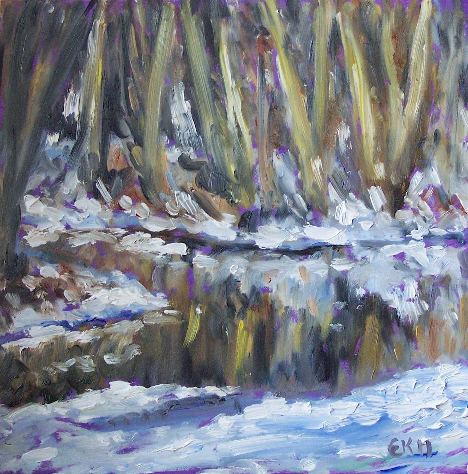
The next little oil, this time of Twin Creek.  Painting snow on a white background seemed a little dull, so I gave this panel an acrylic wash in purple before starting.  You can see it poking through here and there.  I kept with the impressionistic feel on this one, laying down the paint quickly and thickly.  I think the reflections turned out pretty well, though they don't really match the trees.  I'll have to pay more attention to that in the future.  And I think I need a bit more practice with trees - some look pretty good, some not so good.   I tend to get a bit bored with tree after tree, something I really should get past considering how much they dominate the landscape around here!