Showing posts with label original artwork. Show all posts

Monday, July 16, 2012

Along Yellowstone Lake

At the Edge of the Lake, 5 1/2x8 pastel, copyright 2012


This painting is from the same spot as the last one, but looking along the shore of Yellowstone Lake instead of across it.  I'm still finding reflections in water a bit tricky.  The images of the closer trees and the clouds turned out, but it's the distant images that I'm struggling with.  Maybe I'm being too self critical, but they just don't quite read right.  Part of the problem perhaps is that the distant tree line is too regular.  Making tree lines regular and symmetrical, especially distant ones, can be hard to avoid.  It seems the eye (and the hand) tends to create patterns where none exist.  More yellow in the foreground shoreline would help too.

This is certainly a learn as you go process in which I am finding both where I am doing well and where improvements need to be made.  This is the last small piece completed to this date, so I need to sit down and do more.  Although I know I need to work on my reflections more, the idea of trying a few geysers sounds like a lot of fun.  Maybe they will help me to loosen up my painting a bit and not fuss so much over the details.  We shall see.

Thursday, July 5, 2012

Starting to get it

Rain Moving Across the Mountains,  5 1/2x8 pastel, copyright 2012

So this is how you paint mountains!  I feel like I'm starting to get the hang of it now.  A strong contrast between light and shadow seems to be lot of the trick, at least if you really want the mountains to pop forward dramatically.  A bit more care in defining the highlighted snow helps.  And perhaps the much darker color of the paper makes a difference too, as I felt like I was using the color rather than trying to cover it up.

The most difficult part of this one was the foreground lake, which looked more like ice and snow than water.  It took a while, but I finally figured out that it was too light - lighter than the sky in fact, something which is generally only true for snow.  Painting choppy waters still eludes me a bit, though contrary to my pervious post I'm back to enjoying the smaller format.  Obviously I have yet to embrace the idea that these should be studies rather than finished paintings, but I just can't help myself, especially when it comes to painting the sky!

By the way, I'm still in Grand Teton National Park for this one.  If you ever find yourself in Yellowstone or Jackson Hole, it's worth a day trip to check out this park.  The mountains are amazingly picturesque and there are many lakes and rivers to reflect their images.  Not surprisingly, there are a number of plein air events and we spotted a few artists working away to capture a little piece of the grandeur.  I'd love to be able to join them someday.

Friday, June 22, 2012

Pompeii update


Last night was the Pompeii Art Show at the Cincinnati Museum Center, and I promise this is the last time all of you will hear about it.  Maybe.

It was a good show with a a wide variety of artwork: abstract paintings, mosaics, sculpture, a handmade book.  Obviously there are a lot of talented artists in the Cincinnati area.  It was a good experience for me personally too.  Over half the pieces sold, including mine - and for more than my starting bid!  I got quite a few compliments from both my fellow artists and from those who came to see the show.

One of the Museum Center's employees told me how happy she was to have the painting hanging in her office for a few days before the show - her mother was the one who actually won the bid, so I'm sure she will see it many more times in the future.  I also had people tell me that they could tell by the attention to detail that I had been to Pompeii.

A few connections in the Cincinnati art world were made that will hopefully be helpful in the future.  And while my very distant hope of picking up the sponsorship of a wealthy executive from Proctor & Gamble or Johnson & Johnson didn't come true, it is a great feeling to hear praises and see my piece sold.  It  feels like a big step forward.

Here's a link to photos from the show, including one of myself and my wonderfully supportive husband.

Tuesday, May 29, 2012

Lake Shore

Lake Shore 9x12 pastel, copyright 2012

This weekend the family spent a lot of time on the water at Leesville Lake, visiting and celebrating birthdays.  It seemed like a good time to practice plein air painting so I packed up all my pastels in a sturdy wooden box that barely fit into a backpack.  Most of them survived although a few smaller bits of the soft ones crumbled, and the pack was pretty heavy.  I'm hoping to lighten the load a bit next time.

Sunday morning I hauled it all down to the lake and sat on the pontoon boat for about an hour, painting the shoreline until the heat got to me.  It was a pretty rough painting, and when I took it home I discovered that I had overcompensated for the brightness of the sunlight and painted far too darkly.  The past two days have been spent trying to fix that issue.

I still haven't decided about the top third of the painting - the foliage of the trees just isn't working.  And it's very green, which is always an issue for the eastern half of the country in the spring - everything is green, making it hard to create a landscape that isn't too monochromatic.  I am pretty happy with the reflection though, so it is definitely worth salvaging even if I do end up cropping off the top third.

Thursday, May 24, 2012

Cat and Kimono

Scout and the Pink Kimono 18x24 pastel, copyright 2012

Back in April I stayed at a friend's house during a weekend workshop.  Her cats two were of course intensely curious about me, and when it came time to get ready for bed they followed me into the guest room.  One of them, a well fed brown tabby named Scout, hopped up on the bed and settled down to keep an eye on me, leaving the floor to the elusive tuxedo, Detective Sabler.  The light on the bedside table was the only one on, and threw wonderful shadows across the cat and the vintage kimono hanging on the wall.  Scout let me take a few photos, mostly in black and white, before hopping off the bed to chase Deets out of the room.  Those photos inspired this painting.

The kimono was tough, I seem to have a hard time with folds of cloth.  But the most challenging and most interesting part was capturing Scout's very typical cat expression - something between curiosity and distain.  

Friday, May 18, 2012

Blue, red and pink

Blue Pot with Red and Pink Flowers 9x12 pastel, copyright 2012

In our front yard we are lucky enough to have a natural artisian spring.  Many years ago my husband's uncle dug it out and lined it with stone so that his grandmother could have flower beds around it.  Although few of her plantings remain, I've added plenty of my own in recent years.  The miniature rose was a Mother's Day gift  and the pink flowers are spiderwort, donated by a neighbor.  Both plants have gone a bit crazy this spring, overrunning their garden spot.

Yesterday I walked around the yard taking reference photos when it occurred to me that it was a perfect day for a bit of plein air painting - sunny and bright and not too hot.  I painted this pastel while waiting for the kids to get off the bus, then touched it up a bit this morning.

Thursday, April 12, 2012

Crabapples at Arlington

Crabapple Blossoms, Arlington National Cemetery 7x5 pastel, copyright 2012
NFS

In late March my daughter went on a class trip to Washington, D.C.   She was very excited about it, and took more 500 pictures.  Many of the photos were flowers and random buildings that caught her eye - we've taught her well!  The cherry trees bloomed very early this year and were just past their peak when she arrived, but the crabapples were in their full glory.  This pastel is based on photo she took at Arlington National Cemetery specifically because she thought I would want to paint it - and of course she was right.

I plan on painting several of these smaller sized pastels to practice for our vacation out west this summer.  The plan is to take a pad of paper and a box of pastels along, stopping along the way for these quick little studies.  Working this small takes a bit of an adjustment, and like the 6x6 oils I've already done, requires me to simplify rather than fuss over details.  I'm looking forward to seeing how it will work out.

Friday, March 23, 2012

Early Morning Flight

Early Morning Flight 12x16 pastel, copyright 2012

I wonder how many of my paintings have been inspired by my early morning walks?  One of these days I will have to count them up, adding this one to the list.  What makes this one different though is that it is not based on a photograph.  I neglected to take my camera with me, and so had to stare and memorize the constantly changing scene, then quickly get it on paper before it was forgotten.  It's the first time I've tried working from memory, and I think it worked out well.  And of course you just can't go wrong with lots of blue.

Monday, March 19, 2012

Morning snow

Light Snow, Bright Morning 12x9 pastel, copyright 2012

It's hard to believe given the unusually warm weather we are experiencing now, but two weeks ago we woke up to a bit of a surprise: an overnight snow.  It was only and inch and was gone by midmorning, but it is the most significant snowfall we've had this winter.  Naturally I grabbed my camera and walked around a bit after the kids got on the bus.

Watching the light slowly creep over the trees and chase back the shadows has become a highlight of my morning, a justification for getting up before the sun.  While I can see this happening from my kitchen window, I realized that morning that I've never watched it in this particular field, which is in the floodplain of the creek and completely surrounded by trees.  It can't be seen from the road, making it almost a secret space, a little hidden surprise at the end of the lane.

Wednesday, March 14, 2012

Ray Hassard pastel workshop, Day 2 Part 2

Still Life on Black 9x12 pastel, copyright 2012

When I concluded that the previous painting was finished, mostly because the paper wouldn't allow me to do any more, Ray came over for a look.  After discussing the paper and techniques for a bit, he noted that I seemed to emphasize deep shadows and dramatic lighting.  I also like to use the side of the pastels to block in large areas of color rather than making careful, precise marks, which he said made my painting very expressive.  That comment in particular has me walking on air.

Then he told me, "I'm going to give you a piece of black paper.  There's about an hour left, lets see what you can do."  Talk about pressure!  But then I realized that really, the pressure was all in my head - after all, it was just a workshop and I only had an hour so if it turned out terribly, no big deal.

To my surprise, it didn't turn out terrible at all.  In fact, I'm quite pleased with it.  Working on black requires a different mind set since typically with pastels you start with the darks and the go lighter, adding the lightest bit last.  With black, your darkest bits are already there so you need to start more in the mid range.   Actually, the biggest problem I had was that the green avocados in a green bowl were rather dull.  Ray pointed out, again, that I needed to place more red around the painting to give it balance and that I needed to make the background more interesting, both of which were true and improved the painting significantly.

So what did I get from this workshop?  I already knew about the underpainting technique and the various papers and pastels.  But I had never tried them before, and reading about these things on the internet is never as good as seeing them and trying them myself.  In the end though, I think it was mostly about getting feedback to reinforce my strengths and point out areas where I need to work.  Keep it loose, keep it simple, keep it dramatic.  Don't ignore the background.  Watch that the colors are well balanced throughout.  Use more red!

I think what I got out of more than anything else is the confidence to see where my strengths are, and especially to see where I need to improve.  I've already framed and hung this painting up in my studio as a reminder both.

Thank you Ray!

Monday, March 12, 2012

Ray Hassard pastel workshop, Day 1

Still Life with Mangos 12x9 pastel, copyright 2012

This weekend's workshop with Ray Hassard at the lovely Baker Hunt Art and Cultural Center in Covington, Kentucky marks the first time I have had any formal instruction in pastel techniques.  It was designed to be a beginning class and while I wouldn't consider myself a beginner, in a way the lack of training puts me in that category.  The whole idea was to play with new techniques, new papers and new pastels.

First of all I have to say that Ray was an excellent teacher.  He was patient and helpful and encouraged me to do more, which is what I needed.  He started out with detailed discussions about the medium, then moved on to a demonstration all the while answering students' questions and enthralling us with stories of his extensive travels overseas.  He was familiar with the methods of other artists, often pausing to point them out in the many instructional books he had brought along.

In the afternoon it was time for the students to have a go at various still lifes he had set up around the room.  I chose a paper I had never used before, La Carte by Sennilier, and was told not to get it even a little bit wet or the water based texture of the paper would simply come off, taking the pastel with it.  While most of the time I used my own pastels, I did dive into his big box of miscellaneous sticks.  This painting is the result of the day's work.

I've decided that I don't really care for the La Carte paper, it's a bit too rough in texture for my tastes.  But I do like the very soft pastels and went back often to a very dark purple from Great American Art Works, a Cincinnati based company.  But what I really got out of the day was Ray pushing me to spread the colors around, especially the red, so that one item (believe it or not, it's a bowl) did not become isolated or pop forward too much.  And he really had me work to keep the background more interesting, always a challenge for me.  Some aspects of it, such as the background and jar, came out well and others like the red bowl and mangos, not so much.  But it was fun the see what works and what doesn't.

Day 2 tomorrow...

Friday, March 2, 2012

Sometimes they come easy

Edge of the Pasture 12x16 pastel, copyright 2012

Our neighbor's property has an open view to the west, and on clear evenings the sunset lights everything up rather dramatically.  I've taken dozens of reference photos from our driveway trying to capture that moment.  Most of the time I've focused on their red barn, but this time is was a large maple tree that caught my eye.  And despite my struggles the past few weeks and the difficult subject matter that trees make, this one didn't give me too much trouble.  The hardest part was in reminding myself to not do too much.  I actually started painting in all the little branches on the maple and all the bushes and trees in the background.  It became obvious rather quickly that so much detail would take forever to paint and would only serve as distractions.  Keep it simple is the best philosophy.

In the news, the annual Art Association of Randolph County juried show is this month, and I've entered two pieces:  October Fields and Morning Mist Near Alexander Bay.  Experience has taught me that larger, more dramatic work is more likely to get noticed, especially in a show as crowded as this one gets.  The reception is next Thursday the 8th at 7:00pm.  I plan on going, assuming the weather holds up.

Wednesday, February 22, 2012

Life Drawing with charcoal pencil

Reading, Hooded Sweater Vest charcoal pencil, copyright 2012

Hands charcoal pencil, copyright 2012

My goal of finishing an oil painting last week was thwarted by a particularly nasty cold virus that killed all motivation.  Life Drawing last night probably would have been skipped as well if my daughter had not agreed to be the model.   My first sketch of her in pastel turned out very rough, but the two charcoal sketches came out pretty well.  The top one doesn't exactly look like her, but I think I am getting better at faces. The pattern in her knit sweater was challenging, but not over thinking it helped.   Perhaps being sick helped me to turn off my brain, but it's not something I'd want to do on a regular basis.

Friday, February 3, 2012

Making it work

Slow Decline 12x16 pastel, copyright 2012

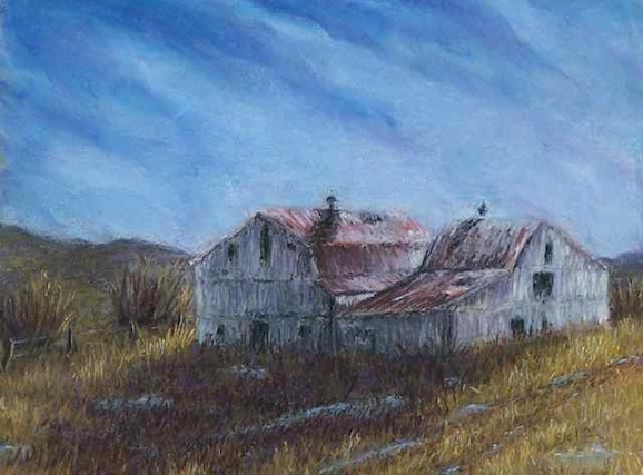
My hair is probably a bit thinner after this one.  It was an incredibly frustrating piece, and was nearly tossed out on several occasions.  At one point everything except the barns was erased.  A big part of the problem was that I neglected to do a smaller study first and ended up putting the barn in the wrong spot to make a good composition.  And the sky was a boring, almost solid blue.  And the shadow in front of the barns was a boring blob of dark.  The barn was only interesting thing about it, and I seriously considered cropping to eliminate the rest.

But after erasing, walking away, and spending time flipping through art books and looking at other people's work on the web, I decided it could be salvaged.  Puddles of water and hints of a fence line and drive helped the foreground, along with lots of texture.  More color and diagonal clouds made the sky much better, and distant hills added depth.

Although this is based on a barn about five miles from my house here in the midwest, it somehow ended up with more of a western feel.  I think that might be due to the lack of green in the grasses and lack of trees in the distant background.  Funny how a painting sometimes goes off in an unexpected direction.  I'm glad I stuck it out.

Thursday, January 26, 2012

October fields

October Fields 12x16 pastel, copyright 2012

Corn and soybeans are the most commonly planted crops in my area, and most farmers rotate their fields yearly between the two.  Corn is more interesting in midsummer, when the long leaves are dark green, topped by pale yellow tassels.  But in the fall, soybeans have them beat.  The leaves on the plants turn bright yellow before they fall off and the remaining stems and seed pods are wonderful shades of warm brown.

I noticed these fields along Twin Creek about five miles north of our house, on a bright October day last year.  There was actually quite a bit more going on in the photograph, with trees along the road and shadows and weeds on the fence line.  The bottom right hand corner got quite complicated - and very distracting.  An eraser solved that problem, and put the emphasis back on the yellow soybeans where it should be.  I have to keep reminding myself that photos are to be used as guidelines only.

Friday, December 16, 2011

Third time's a charm

Early Morning Frost 12x9 pastel, copyright 2011

This one is from the same spot and the same sunrise as the previous two landscapes, but looking in the opposite direction.  Despite the resentment of this night owl for having to get up at this hour, it really is a magical time.  In particular I have a fascination with watching the shadows on the trees slowly slide down to the ground as the sun creeps over the edge of the hills behind our house.  Every clear morning it's the same, yet somehow different.  I've tried to capture that a bit of that idea here.  While the previous pastel was all about the light, this one became all about the mood.

As a historical aside, nearly two years ago I painted this same barn.  It amazes me how much progress I've made since then, and I get exciting thinking about how much better I can get.

Tuesday, December 13, 2011

Portrait attempt

Study of a Redhead 12x16 pastel, copyright 2011

Wow, portraits are hard!  This one started out as a portrait of my daughter, based on a sketch done during Life Drawing last week.  After hours and hours of working, erasing, and reworking, I finally gave up trying to make it look like her.  The only thing I kept was the hair.  I wonder if it's easier to do a portrait of someone you don't know as well.

Wednesday, December 7, 2011

One sunrise, but not the same

      Sunrise, First of December 6x6 oil, copyright 2011

December Sunrise 12x9 pastel, copyright 2011

A first for me, two different paintings from the same reference photograph.  The first was just a quick study, painted the same day I took the photo.  It came out a bit softer and more muted, in part because I was spent perhaps 15 more minutes on it than I should have, and was starting to make mud.  I stopped when I realized it, made a few corrections then quit.  The second one I finished just yesterday, and perhaps overcompensated a bit for the earlier painting's softness, though the colors look a bit too saturated on my monitor.

Looking at the two of them together, I can't decide if one is really better than the other as both capture some aspects of the mood of the moment.  I'm not sure if it's the media or light in the studio or my subconscious that made them so different.  It's an exercise worth trying again with another photo.

Edit:  The pastel image has been revised, and is now a bit closer to the real thing.

Monday, November 21, 2011

Back to basics

Toronto Waterfront Skyline 5x7 graphite pencil, copyright 2011
click to purchase this sketch

The count of nearly finished paintings this month is up to three.  I seem to keep hitting a wall with these bigger ones. They are all almost but not quite there, and I end up getting frustrated and setting them aside.  To give myself a break, a little sketchbook was dusted off and it was back to basics with a pencil drawing. It's been awhile since I've done anything in pencil and it was a nice refresher, a reminder to keep it simple.  This one is from a photo I took this summer, looking at Toronto from a ferry ride to the regional airport.   Only about 2/3 of the CN Tower fit into the sketch, which of course dominates the skyline in its extreme scale.

On a technical note, I've been getting a lot of hits from questionable web sites based in Russia.  One of them even had a notice that it had been removed due to copyright violations.  Seems a bit suspicious, and since I hate to cover my images with watermarks that can be removed by determined and patient personnel, I'm going to start post the images at a lower quality.  Hopefully that won't affect how they look on a computer monitor, but it should discourage printing them out.

Monday, October 10, 2011

October trees

Trees Study, Early October 12x16 pastel, copyright 2011

This autumn the trees have been unusually colorful; it seems we got the right amount of rain and cool temperatures followed by ten clear, warm days that made the perfect combination for a wonderful show.  I've taken many reference photos to hopefully cheer me up during the dreary wet late autumn that will soon be here.  I spotted this pair of trees about a week ago on the way to Greenville to pick up my artwork from a show and ended up turning around and driving past twice to get the shot.  Thankfully traffic was non-existant at the time.  Today is likely the last clear day and I plan on spending some time getting a few more photos.

The show in Greenville late last month gave me a bit of a birthday surprise: my painting, White Zinnia, won the purchase award.  This means a local business promised to buy a piece from the show, with some of the proceeds going to the Greenville Art Guild.  This is the first time that one of my pieces has been purchased by someone at random, who has never met me and is unfamiliar with my work.  It feels like a big step forward.  A special thanks to Granny's Corner Frame Shop in Greenville.

An update on my plans for etsy:  I have ordered some supplies, which are now on back order.  This is why haven't set anything up yet.  They are pastel supplies, including cut mats that I plan on including with sold pieces.  I'm getting a bit tired of waiting on them, and the date of their availability keeps changing, so I may just go ahead and start putting oil paintings on there and hold off on the pastels until the mats arrive.  I'll post once everything is up and running.