Showing posts with label country scene. Show all posts

Tuesday, November 19, 2013

Gold and Blue

Some time ago I bought a large number of handmade cotton rag paper with the intent of using it for pastels.  It has an interesting texture, wonderfully torn edges and comes in 25 colors.  When I got caught up in oil painting this spring, the paper was forgotten.  It sat neglected in a drawer for many months until a studio clean up this summer brought it back to light.

At the time, the winter wheat was ripening and the contrast of golden yellow with bright blue skies was irresistible and this paper seemed perfect for it.  There are two of them right now, and since they seem to make a pair I mounted them together on a piece of matboard to show of the edges.  Both are currently available in my etsy shop.

Top: Through the Fields 8 1/2x11 pastel, copyright 2013
Bottom: Turning to Gold 8 1/2x11 pastel, copyright 2013

Sunday, November 3, 2013

Back in the Saddle

My blog has been ignored lately, and for that I apologize.  It has been a crazy six months as I have a tendency to overcommit myself to non-art.  I've also been focusing on my Facebook page, since I am often on there anyway talking with geographically scattered friends and relatives.  And while Facebook has been attracting a lot of views, this blog seems to be attracting mostly spam.  But Facebook has its limitations; the biggest one being that it is difficult to "follow" if you are not on Facebook.  But I'm willing to try again for those loyal few who are legitimately following this blog and who justifiably have a dislike for social media.

Let's start with some more recent pastels, and then I'll work backwards a bit, interspersed with new works as they come along.

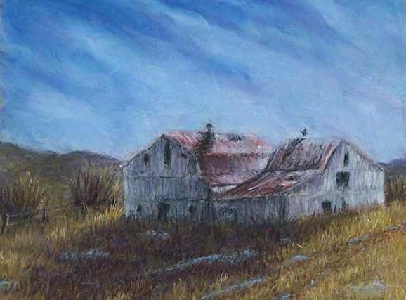
It's common for pastelists to mat their work, which means we often have scraps and bits of mat board just sitting around in a pile.  Another artist whose blog I follow, Karen Margulis, has said that she often uses scraps for quick studies and sketches, so I decided to give that a try.  I had two long narrow pieces in a warm dark grey that would work for panoramic scenes.  Here are the results:

Dormant 5x14 pastel, copyright 2013

End of Summer 6x16 pastel, copyright 2013

Turns out, this shape suits me quite well!  They ended up more as finished pieces than sketches but I am quite pleased with the results.  I'll admit to giving myself a little pat on the back for the snow scene in particular.  It can be a bit of a challenge to work out the composition on unusually shaped pieces, so I played around with cropping the reference photos first, then sketched them in charcoal and dark pastel until I was happy.  After that they almost painted themselves.

The Dayton Society of Painters and Sculptors has an annual invitational for new members each December, I've decided that the snow scene will be one of my entries.  The next challenge will be getting a custom frame!

Friday, March 8, 2013

Waiting for spring

Waiting for Spring 9x12 pastel, copyright 2013

The weather has been volatile this past week - it is March after all - wrecking havoc on sinuses but making for excellent scenery.  The beginning of the week saw heavy clouds and patches of flurries, but there were holes in clouds allowing sunlight to stream through.  I spent more than hour chasing the sunlight down backroads new to me and somehow managed not to get lost.  There were a few times when I wasn't sure exactly where I was, but I did manage to find my way back without having to consult a map, so I can say I was never completely lost.

This little gem of a spot came up unexpectedly when the road took a sudden turn to the right and meandered along a creek.  Corn and soybeans are the most crops around here, but winter wheat is my favorite to paint, as it turns the most wonderful shade of gold when ripe.  Right now it is dormant and a sort greenish yellow as opposed to the brown earth in the other, fallow fields.  Though the darkening clouds foretold six inches of snow (and a day off from school for the kids) later in the week, the bright field predicts that spring is just around the corner.  I am certainly ready for it.

Monday, February 25, 2013

Last Light

Last Light 11x14 pastel, copyright 2013

After I had so much fun with the little 6x6 pastels on claybord, I decided to try again with a larger one.   It works!  I am really loving this surface.  It doesn't take as many layers as the paper, but that's a good thing.  I tend to try to correct mistakes by adding more color and end up with "mud".  It takes some effort to fix when it's on paper and I've ruined a few erasers (and some paper) in the attempt.  But with this surface I can just wipe it down with a wet rag, paint on a little more primer and go back to work.  Perfect!

This scene is from a series of photos I took this fall while my husband drove me around the backroads near our house.  I've gotten a lot of inspiration from those photos, so don't be surprised if you see even more of them in the future.

Monday, February 18, 2013

Evening Glow

Evening Glow 6x6 pastel, copyright 2013
available for purchase $75 in my etsy shop

Two years ago I was experimenting with a new (to me) surface for oil paintings: 6x6 clayboard.   Designed for water based media, the clay coated surface soaked up the oils.  I coated it with pastel primer to make it less absorbant and also gave it a bit of texture.

Lately I've been thinking about surfaces for my pastels, something a little more sturdy but not outrageously expensive.  Some artists use gatorboard, but it isn't acid free.  Suddenly it occurred to me that clayboard would do the trick.  There were only two pieces left.  The first was covered in red acrylic, then pastel primer was applied with a very soft bristle brush.  On the second I used pink.

The results?  It's perfect!  The first one turned out quite well, the clayboard works just as well as any sanded paper, plus when framed it needs no backing board for support.  It looks great in the gold frame I had bought for the oil paintings.  The second one turned into a wiper, but that's okay - I just took it to the kitchen sink and sprayed it down - now it's good to go.  The other nice thing about clayboard is that it can be purchased in large sheets and cut down to size.  I think I'm going to have fun with this!

Wednesday, January 30, 2013

Listening

For the past two weeks I have been struggling with three different pastels, each very different from the other other but all of them giving me fits.  One is nearly done but not quite there.  The other I may give up on, it's been wiped down twice already.  And then there is this one.

Drifting Fenceline 9x12 pastel, copyright 2013

It started out as a painting of a plowed field, snow covering the furrows in rows behind one lone fencepost.  It works quite nicely as a photo.  But those nice neat little rows did not want to work in a painting.  First the perspective was wrong.  Then the shadows.  Then the color.  The pastel layers kept getting thicker and thicker until I finally realized I was just making mud - or perhaps slush would be a more appropriate term.

Last night I finally gave in, wiped the snow off completely and started over.  It just did not want to be a plowed field, and I'm slowly starting to learn to "listen" to my paintings.   They want to be painted, but they sometimes seem to have their own opinion about what they want to say.  And this one was reminding me to simplify - so that's what I did.


Friday, January 18, 2013

Snowy farmstead

Snowed In 12x9 pastel, copyright 2013

Though long gone, it seems there is still plenty of inspiration to be found in the snow.  The reference photo was a drive-by on my way to pick up some paintings in Sidney.  It was not a very good photo and included reflections in the window and some of the car door, but it was good enough for a starting point.  From that it was mostly a matter of being confident enough to trust to "artistic license".

Tuesday, December 11, 2012

Fresh eyes

Breaking Through the Clouds 9x12 pastel, copyright 2012

Sometime working in a home studio is a bit isolating.  Being surrounded by fellow artists can offer unexpected insights as well as lively discussion on color theory, perspective, art history... all the technical details of what goes into a painting.  But sometime the technicalities and techniques can bog you down, especially when the only insight you really need is, does it look right?

Despite his protestations of "I'm not an artist", I have managed to convince my husband that his insights are quite helpful.  With this painting, he pointed out that it looked much better when the large, closer tree was more defined.  There are reasons for this having to do with perspective and line and depth; the simple truth is, he was right and it does look better.  Sometimes all it takes is fresh eyes.


Saturday, December 8, 2012

Back to landscapes

Silos 9x12 pastel, copyright 2012

The right lighting can make just about anything interesting, even something as ordinary as grain silos.  Spotted from the road on the way home from Oxford after a football game, this grouping was catching the sun in just the right way.  

One of the challenges of painting metallic objects is "bounced" color.  Bounced color refers to the color that objects reflect onto one another.  It is not a true reflection but more about how the color and light of objects in close vicinity affect each others' appearance.  It's more obvious in more reflective objects such as metal and glass, but it happens on others as well.  For a good discussion on how artists can address bounced color, check out this post by Canadian artist Gaye Adams.

On a more personal note, I've found that the break from landscapes has been an excellent refresher.  I was getting a bit bogged down and frustrated, and starting to have doubts about whether my work was truly unique and worthwhile.  After all, there are a lot of landscape painters out there.  But stepping back helped remind of what I find most attractive about painting - capturing those fleeting moments when bright light and warm color and deep shadow come together to create a "luminous brightscape".  I think the description fits my work, and that is where I need to focus myself.

Monday, August 27, 2012

Morning Drive

Morning Drive 12x9 pastel, copyright 2012
SOLD

Last week was the start of the back to school routine of getting up far too early for my taste.  The dog is happy though, as it means we are also back to our morning walk.  And really it's a good thing for me as well, so long as I remember to bring my camera along.  Or in this case, my cell phone.

One of our neighbors has a long gravel driveway that wanders between a little creek and a corn field before heading up the hill.  Friday morning the sun was just breaking through the mist behind the trees as I walked by, making wonderful highlights.   Here's an excellent discussion on what artists refer to as the "magic hour", the time around sunrise and sunset.

I tried something a bit different this time: working from the image on my phone rather than loading it on to the computer.  Having to work from such a small image was challenging yet good, as not being able to see the details made simplifying easier.  The fact that the image was still fresh in my mind helped too.  I initially tried getting the sunbeams in the mist, but that didn't really work and as it turned out, wasn't needed.


Thursday, May 3, 2012

Morning View

Remnants of an Early Morning Storm 9x12 pastel, copyright 2012

The weather has been a bit crazy all year, and this week was no exception.  Saturday we sat bundled up in cold, cold rain until the soccer game we were watching was cancelled due to lightening.  By Monday I was reading a book outside in short sleeves.  The storms have been coming a bit more frequently and the wild swings in temperature have been making life interesting.

One such storm came during the night, breaking apart by morning.  Our neighbors have a small wetland area that often gathers fog, and morning views can be quite dramatic.  This painting is what my daughter and I saw the other day as we waited on the bus.

Monday, March 19, 2012

Morning snow

Light Snow, Bright Morning 12x9 pastel, copyright 2012

It's hard to believe given the unusually warm weather we are experiencing now, but two weeks ago we woke up to a bit of a surprise: an overnight snow.  It was only and inch and was gone by midmorning, but it is the most significant snowfall we've had this winter.  Naturally I grabbed my camera and walked around a bit after the kids got on the bus.

Watching the light slowly creep over the trees and chase back the shadows has become a highlight of my morning, a justification for getting up before the sun.  While I can see this happening from my kitchen window, I realized that morning that I've never watched it in this particular field, which is in the floodplain of the creek and completely surrounded by trees.  It can't be seen from the road, making it almost a secret space, a little hidden surprise at the end of the lane.

Friday, March 2, 2012

Sometimes they come easy

Edge of the Pasture 12x16 pastel, copyright 2012

Our neighbor's property has an open view to the west, and on clear evenings the sunset lights everything up rather dramatically.  I've taken dozens of reference photos from our driveway trying to capture that moment.  Most of the time I've focused on their red barn, but this time is was a large maple tree that caught my eye.  And despite my struggles the past few weeks and the difficult subject matter that trees make, this one didn't give me too much trouble.  The hardest part was in reminding myself to not do too much.  I actually started painting in all the little branches on the maple and all the bushes and trees in the background.  It became obvious rather quickly that so much detail would take forever to paint and would only serve as distractions.  Keep it simple is the best philosophy.

In the news, the annual Art Association of Randolph County juried show is this month, and I've entered two pieces:  October Fields and Morning Mist Near Alexander Bay.  Experience has taught me that larger, more dramatic work is more likely to get noticed, especially in a show as crowded as this one gets.  The reception is next Thursday the 8th at 7:00pm.  I plan on going, assuming the weather holds up.

Friday, February 24, 2012

Red Barns

Red Barn, Green Grass 8x10 pastel, copyright 2012

A few weeks ago, this pastel was considered a failure.  Something about it just wasn't right.  It sat in the studio mocking me, daring to me to call it quits and give up.  I moved on, trying to ignore it while working on an oil, recovering from a cold and thinking about spring shows.  Today it was finally decided to put it away for good.  But maybe, with a little touch up here, a little cropping there, it would work.  Guess it's a good thing I gave it another chance.  The title, by the way, was suggested by my son.  Kids are always an excellent resource when you run out of ideas.

Friday, February 3, 2012

Making it work

Slow Decline 12x16 pastel, copyright 2012

My hair is probably a bit thinner after this one.  It was an incredibly frustrating piece, and was nearly tossed out on several occasions.  At one point everything except the barns was erased.  A big part of the problem was that I neglected to do a smaller study first and ended up putting the barn in the wrong spot to make a good composition.  And the sky was a boring, almost solid blue.  And the shadow in front of the barns was a boring blob of dark.  The barn was only interesting thing about it, and I seriously considered cropping to eliminate the rest.

But after erasing, walking away, and spending time flipping through art books and looking at other people's work on the web, I decided it could be salvaged.  Puddles of water and hints of a fence line and drive helped the foreground, along with lots of texture.  More color and diagonal clouds made the sky much better, and distant hills added depth.

Although this is based on a barn about five miles from my house here in the midwest, it somehow ended up with more of a western feel.  I think that might be due to the lack of green in the grasses and lack of trees in the distant background.  Funny how a painting sometimes goes off in an unexpected direction.  I'm glad I stuck it out.

Thursday, January 26, 2012

October fields

October Fields 12x16 pastel, copyright 2012

Corn and soybeans are the most commonly planted crops in my area, and most farmers rotate their fields yearly between the two.  Corn is more interesting in midsummer, when the long leaves are dark green, topped by pale yellow tassels.  But in the fall, soybeans have them beat.  The leaves on the plants turn bright yellow before they fall off and the remaining stems and seed pods are wonderful shades of warm brown.

I noticed these fields along Twin Creek about five miles north of our house, on a bright October day last year.  There was actually quite a bit more going on in the photograph, with trees along the road and shadows and weeds on the fence line.  The bottom right hand corner got quite complicated - and very distracting.  An eraser solved that problem, and put the emphasis back on the yellow soybeans where it should be.  I have to keep reminding myself that photos are to be used as guidelines only.

Sunday, January 22, 2012

The Art of Cropping

In the Conservatory 7x9 pastel, copyright 2012

These are the two pastels I was struggling with last week.  In the Conservatory is based on a photograph I took some years ago during a visit to the Franklin Park Conservatory in Columbus.  If you are ever in the city it's worth the visit, especially during the butterfly exhibit in the spring.  They have some Chihuly pieces on permanent display, making a wonderful backdrop of color for the butterflies and the koi.  

Ice on the Creek Bank was my attempt at plein air, when I succeeded only in freezing my fingers.  Both of these started out as 16x12 paintings that just would not work to my satisfaction.  I nearly gave up on them but there were just enough bits in both to make me think they were worth keeping.

Just the other day it occurred to me that maybe the best parts could be salvaged and the rest discarded.  Exacto knife and right angle ruler in hand, they were cut up before self doubt could stop me, and both ended up the better for it.

Ice on the Creek Bank 5x7 pastel, copyright 2012

Wednesday, January 11, 2012

January Sunshine

Bank Barn, January Sun 16x12 pastel, copyright 2012

I've been thinking about tackling the challenge of plein air painting a lot lately, building up the courage to try it again.  My last few attempts have ended in frustration.  The most difficult thing for me is finding a focal point.  Using photographs is so much easier because I can crop and shift the frame around until it suits me.  And the light never changes in a photograph.

But the light and the colors aren't 100% accurate in photographs and subtleties can get lost.  So I decided to try it again yesterday, taking advantage of what was most likely the last unseasonably nice weather for awhile.  Our bank barn is a natural focal point and one very familiar to me.  In the warm afternoon sunshine I sat out on our driveway for a little over an hour and painted this pastel while fending off a cat that wanted to sleep on the pastels and a German shepherd mix that thinks she's a lap dog.

Working quickly is essential since the light is constantly changing, so I left out a lot of details like brush and stonework and focused on basic shapes, light and shadow.  By the time I finished the shadows had shifted and were creeping up the side of the barn.  I was pleasantly surprised with how it turned out - the high contrast is something that probably would have been lost working from a photograph.  A few minor touch ups this morning finished it off, mostly just cleaning up the lines.  Now that I know that I can do it, I'll have to try again next time the sun shines.  Of course it may be awhile before that happens.

Thursday, January 5, 2012

Warm thoughts

Midsummer Barn 16x12 pastel, copyright 2012

I hope everyone had a wonderful and safe holiday season.  We live fairly close to much of our family and were able to celebrate with them.  My many cousins and adorable little nephew are always good for smiles.  Needless to say, I haven't done a whole lot of artwork for the past weeks.

However, on the second day of the new year we had our first measurable (about 1 inch) of snow, and it got me wishing for warmer weather already.  I sorted through the many photos taken over the summer and fall, finally settling on this one.  If it looks at all familiar, this is the same spot and same barn I painted late last year from a frosty morning.

This one was more of a struggle for me as I had a lot of trouble getting the shadows of the trees to look right.  First they were too patchy, then too purple, then too solid.  And I had grasses with seed heads on the lower right, but found it too distracting and so took them out.  When in doubt, simplify!  Making the middle foreground lighter helped too - without that light area, the barn was far too strong of an element.  I think I finally got it right, and am pleased with the depth it has.  The road/field looks like it just keeps going off to the right - which it does.  One of these days I will get permission to walk down that way.  Once it gets warm again, that is.