Saturday, December 29, 2012

Playing the blues

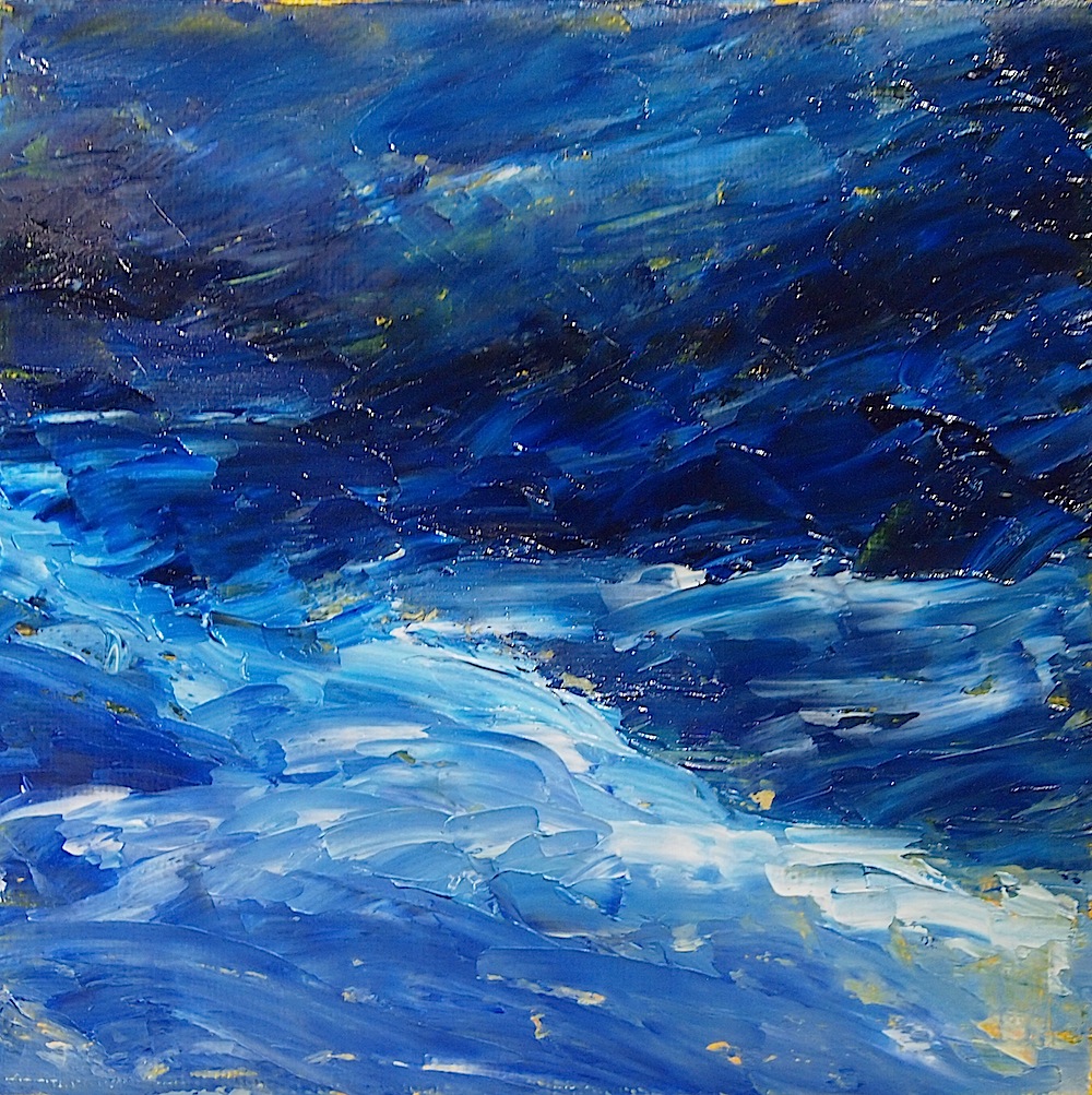
untitled blue 6x6 oil, copyright 2012

A week or so ago I found myself very frustrated with a pastel - it wasn't (and really still isn't) working out and I needed a break from it.  There are a few of this little gallery wrap canvases lying around, so I decided to attack one with blue paint and a palette knife.  The original plan, such as it was, was to paint the sky with a few clouds.  That notion disappeared as the paint got thicker and took a life of its own.   If you squint a little bit, it almost looks like a landscape, maybe water rushing around hills or mountains.    Or not.  

I haven't decided if I will keep or paint over it, but it was therapeutic to not have to worry about the end result.  And of course I do love my blues!

Wednesday, December 19, 2012

Get on your boots

Girl with a Cat 12x16 charcoal, copyright 2012

I was able to get to Life Drawing this week, not that I had much choice; my daughter was the model.  At the request of some of the artists she wore boots.  She has quite the collection now, and they are fun to draw.  The gallery cat, Gilda, loves Life Drawing too since it means she gets to curl up with someone who has to stay and pet her.  

Black and white charcoal works quite well on grey toned pastel paper, and I like how this one turned out overall.  I'll have to play with this set up more often.

In other news, right now I have a pastel landscape with a dramatic sky sitting on my easel, trying to duplicate the "wow" factor of the previous one.  It's not going as well as I'd like and with the frantic-ness of the holidays, it's hard to tell when I'll have the time or the right mind set to get it done right.  I may not post again until after Christmas, so have a good one for those of you who celebrate the holiday!

Tuesday, December 11, 2012

Fresh eyes

Breaking Through the Clouds 9x12 pastel, copyright 2012

Sometime working in a home studio is a bit isolating.  Being surrounded by fellow artists can offer unexpected insights as well as lively discussion on color theory, perspective, art history... all the technical details of what goes into a painting.  But sometime the technicalities and techniques can bog you down, especially when the only insight you really need is, does it look right?

Despite his protestations of "I'm not an artist", I have managed to convince my husband that his insights are quite helpful.  With this painting, he pointed out that it looked much better when the large, closer tree was more defined.  There are reasons for this having to do with perspective and line and depth; the simple truth is, he was right and it does look better.  Sometimes all it takes is fresh eyes.


Saturday, December 8, 2012

Back to landscapes

Silos 9x12 pastel, copyright 2012

The right lighting can make just about anything interesting, even something as ordinary as grain silos.  Spotted from the road on the way home from Oxford after a football game, this grouping was catching the sun in just the right way.  

One of the challenges of painting metallic objects is "bounced" color.  Bounced color refers to the color that objects reflect onto one another.  It is not a true reflection but more about how the color and light of objects in close vicinity affect each others' appearance.  It's more obvious in more reflective objects such as metal and glass, but it happens on others as well.  For a good discussion on how artists can address bounced color, check out this post by Canadian artist Gaye Adams.

On a more personal note, I've found that the break from landscapes has been an excellent refresher.  I was getting a bit bogged down and frustrated, and starting to have doubts about whether my work was truly unique and worthwhile.  After all, there are a lot of landscape painters out there.  But stepping back helped remind of what I find most attractive about painting - capturing those fleeting moments when bright light and warm color and deep shadow come together to create a "luminous brightscape".  I think the description fits my work, and that is where I need to focus myself.

Friday, December 7, 2012

Beyond blue

Reveal 16x20 oil on panel, copyright 2012

Clouds breaking apart to let a bit of sunshine peek through inspired the last of these sky paintings.  I have to admit that this one gave me a lot more trouble than the other three.  The problem seemed to be that I tried to hard to make it look like the photograph instead of just letting go where it wanted to go.  The paint got pretty thick, then hard to move around and impossible to create the softer feeling of the previous painting.  After a few days of drying I worked on it a bit more, let it dry slightly, then went over it with a dry brush to soften some of the edges.  I still see places that could be changed, but over working is always a danger and it's best to quit while you're ahead.

This is the last of the sky paintings only because I had only four panels.  They were a good break from my typical landscapes, a way to get the creative juices flowing again.  I will be purchasing more of these panels to keep handy when breaks are needed, so you can expect to see them at random.  And the paintings were certainly helpful - I got back into pastel landscapes this week and will be posting one soon.  It's one of my best yet, at least in my humble opinion!

Wednesday, December 5, 2012

Tis the season

Red Ornament 6x8 pastel, copyright 2012
SOLD

It's the holiday season, so I decided to try a quick sketch of one of my favorite things, a glass ornament. My brother and his wife bought this one for me in Venice.  My glass collection includes a number of pieces from Venice as I find handmade glass far more appealing than shoes and handbags.  May is the best time to visit, before the tourists swarm the place and the heat and humidity get unbearable.  It's good place to get lost, wandering through the back streets admiring the architecture and the locals - just don't cross a bridge, or you will get really lost!

This particular ornament has gold leafing wrapped around it, but I haven't quite figured out how to paint gold yet.  I have another ornament made from Murano beads that needs to be painted sometime, though with its many colors it won't be a quick sketch.  Another ornament, painted in oil, is currently available at the Preble County Fine Arts Center in Eaton, Ohio.

Monday, December 3, 2012

Cobalt blues

Light of Dawn 16x20 oil on panel, copyright 2012

Inspired by a photograph taken several years ago, this is my favorite of the skies so far.   The photo had quite a bit of purple, but the painting wanted to be more blue, so I just went along.  Some time ago a friend was generous enough to give me quite a few oils that she no longer had an interest in using, and cobalt blue was among the colors.  It's been fun mixing it with white and the other blues to find new colors, and I am loving the brightness of it.